# NOTE: This notebook uses the polars package
import pandas as pd
import pandas.api.types as pdtypes
import numpy as np

from plotnine import *
import polars as pl
from polars import colRanges of Similar Variables
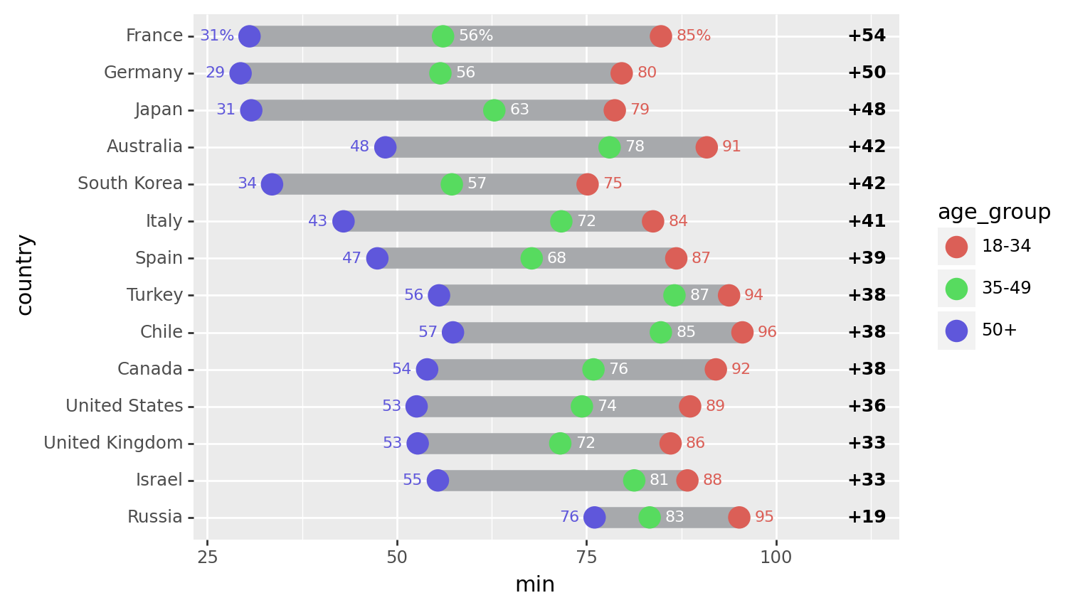
Comparing the point to point difference of many similar variables
Read the data.
Source: Pew Research Global Attitudes Spring 2015
!head -n 20 'data/survey-social-media.csv'PSRAID,COUNTRY,Q145,Q146,Q70,Q74
100000,Ethiopia,Female,35,No,
100001,Ethiopia,Female,25,No,
100002,Ethiopia,Male,40,Don’t know,
100003,Ethiopia,Female,30,Don’t know,
100004,Ethiopia,Male,22,No,
100005,Ethiopia,Male,40,No,
100006,Ethiopia,Female,20,No,
100007,Ethiopia,Female,18,No,No
100008,Ethiopia,Male,50,No,
100009,Ethiopia,Male,35,No,
100010,Ethiopia,Female,20,No,
100011,Ethiopia,Female,30,Don’t know,
100012,Ethiopia,Male,60,No,
100013,Ethiopia,Male,18,No,
100014,Ethiopia,Male,40,No,
100015,Ethiopia,Male,28,Don’t know,
100016,Ethiopia,Female,55,Don’t know,
100017,Ethiopia,Male,30,Don’t know,
100018,Ethiopia,Female,22,No, columns = dict(
COUNTRY='country',
Q145='gender',
Q146='age',
Q70='use_internet',
Q74='use_social_media'
)
data = pl.scan_csv(
'data/survey-social-media.csv',
dtypes=dict(Q146=pl.Utf8),
).rename(
columns
).select([
'country',
'age',
'use_social_media'
]).collect()
data.sample(10, seed=123)
shape: (10, 3)
| country | age | use_social_media |
|---|---|---|
| str | str | str |
| "Venezuela" | "47" | "Yes" |
| "Israel" | "63" | " " |
| "Germany" | "60" | "Yes" |
| "France" | "60" | "No" |
| "Philippines" | "25" | " " |
| "China" | "40" | " " |
| "Senegal" | "20" | " " |
| "Argentina" | "47" | "Yes" |
| "India" | "53" | "No" |
| "Jordan" | "24" | " " |
Create age groups for users of social media
yes_no = ['Yes', 'No']
valid_age_groups = ['18-34', '35-49', '50+']

rdata = data.with_columns([
    pl
    .when(col('age') <= '34').then('18-34')
    .when(col('age') <= '49').then('35-49')
    .when(col('age') < '98').then('50+')
    .otherwise("")
    .alias('age_group'),
    pl.count().over("country").alias('country_count')
]).filter(
    col('age_group').is_in(valid_age_groups) &
    col('use_social_media').is_in(yes_no)
).groupby(['country', 'age_group']).agg([
    # social media use percentage
    ((col('use_social_media') == 'Yes').sum() * 100 / pl.count()).alias('sm_use_percent'),

    # social media question response rate
    (col('use_social_media').is_in(yes_no).sum() * 100 / col('country_count').first()).alias('smq_response_rate')
]).sort(['country', 'age_group'])

rdata.head()
shape: (5, 4)
| country | age_group | sm_use_percent | smq_response_rate |
|---|---|---|---|
| str | str | f64 | f64 |
| "Argentina" | "18-34" | 90.883191 | 35.1 |
| "Argentina" | "35-49" | 84.40367 | 21.8 |
| "Argentina" | "50+" | 67.333333 | 15.0 |
| "Australia" | "18-34" | 90.862944 | 19.621514 |
| "Australia" | "35-49" | 78.04878 | 20.418327 |
Top 14 countries by response rate to the social media question.
def col_format(name, fmt):
    # Format useing python formating
    # for more control over
    return col(name).apply(lambda x: fmt.format(x=x))

def float_to_str_round(name):
    return col_format(name, '{x:.0f}')

n = 14

top = rdata.groupby('country').agg([
    col('smq_response_rate').sum().alias('r')
]).sort('r', reverse=True).head(n)
top_countries = top['country']

expr = float_to_str_round('sm_use_percent')
expr_pct = expr + '%'

point_data = rdata.filter(
    col('country').is_in(top_countries)
).with_column(
    pl.when(col('country') == 'France').then(expr_pct).otherwise(expr).alias('sm_use_percent_str')
)

point_data.head()
shape: (5, 5)
| country | age_group | sm_use_percent | smq_response_rate | sm_use_percent_str |
|---|---|---|---|---|
| str | str | f64 | f64 | str |
| "Australia" | "18-34" | 90.862944 | 19.621514 | "91" |
| "Australia" | "35-49" | 78.04878 | 20.418327 | "78" |
| "Australia" | "50+" | 48.479087 | 52.390438 | "48" |
| "Canada" | "18-34" | 92.063492 | 25.099602 | "92" |
| "Canada" | "35-49" | 75.925926 | 21.513944 | "76" |
segment_data = point_data.groupby('country').agg([
    col('sm_use_percent').min().alias('min'),
    col('sm_use_percent').max().alias('max'),
]).with_column(
    (col('max') - col('min')).alias('gap')
).sort(
    'gap',
).with_columns([
    float_to_str_round('min').alias('min_str'),
    float_to_str_round('max').alias('max_str'),
    float_to_str_round('gap').alias('gap_str')
])

segment_data.head()
shape: (5, 7)
| country | min | max | gap | min_str | max_str | gap_str |
|---|---|---|---|---|---|---|
| str | f64 | f64 | f64 | str | str | str |
| "Russia" | 76.07362 | 95.151515 | 19.077896 | "76" | "95" | "19" |
| "Israel" | 55.405405 | 88.311688 | 32.906283 | "55" | "88" | "33" |
| "United Kingdom... | 52.74463 | 86.096257 | 33.351627 | "53" | "86" | "33" |
| "United States" | 52.597403 | 88.669951 | 36.072548 | "53" | "89" | "36" |
| "Canada" | 53.986333 | 92.063492 | 38.077159 | "54" | "92" | "38" |
Format the floating point data that will be plotted into strings
Set the order of the countries along the y-axis by setting the country variable to an ordered categorical.
country_expr = col('country').cast(pl.Categorical)
segment_data = segment_data.with_column(country_expr)
point_data = point_data.with_columns(country_expr)
First plot
# The right column (youngest-oldest gap) location
xgap = 112

(ggplot()
 # Range strip
 + geom_segment(
     segment_data,
     aes(x='min', xend='max', y='country', yend='country'),
     size=6,
     color='#a7a9ac'
 )
 # Age group markers
 + geom_point(
     point_data,
     aes('sm_use_percent', 'country', color='age_group', fill='age_group'),
     size=5,
     stroke=0.7,
 )
 # Age group percentages
 + geom_text(
     point_data.filter(col('age_group')=="50+"),
     aes(x='sm_use_percent-2', y='country', label='sm_use_percent_str', color='age_group'),
     size=8,
     ha='right'
 )
 + geom_text(
     point_data.filter(col('age_group')=="35-49"),
     aes(x='sm_use_percent+2', y='country', label='sm_use_percent_str'),
     size=8,
     ha='left',
     va='center',
     color='white'
 )
 + geom_text(
     point_data.filter(col('age_group')=="18-34"),
     aes(x='sm_use_percent+2', y='country', label='sm_use_percent_str', color='age_group'),
     size=8,
     ha='left',
 )
 # gap difference
 + geom_text(
     segment_data,
     aes(x=xgap, y='country', label='gap_str'),
     size=9,
     fontweight='bold',
     format_string='+{}'
 )
)
Tweak it
# The right column (youngest-oldest gap) location
xgap = 115

# Gallery Plot

(ggplot()
 # Background Strips                                     # new
 + geom_segment(
     segment_data,
     aes(y='country', yend='country'),
     x=0, xend=100,
     size=8.5,
     color='#edece3'
 )
 # vertical grid lines along the strips                  # new
 + annotate(
     'segment',
     x=list(range(10, 100, 10)) * n,
     xend=list(range(10, 100, 10)) * n,
     y=np.tile(np.arange(1, n+1), 9)-.25,
     yend=np.tile(np.arange(1, n+1), 9) + .25,
     color='#CCCCCC'
 )
 # Range strip
 + geom_segment(
     segment_data,
     aes(x='min', xend='max', y='country', yend='country'),
     size=6,
     color='#a7a9ac'
 )
 # Age group markers
 + geom_point(
     point_data,
     aes('sm_use_percent', 'country', color='age_group', fill='age_group'),
     size=5,
     stroke=0.7,
 )
 # Age group percentages
 + geom_text(
     point_data.filter(col('age_group')=="50+"),
     aes(x='sm_use_percent-2', y='country', label='sm_use_percent_str', color='age_group'),
     size=8,
     ha='right',
 )
 + geom_text(
     point_data.filter(col('age_group')=="35-49"),
     aes(x='sm_use_percent+2', y='country', label='sm_use_percent_str'),
     size=8,
     ha='left',
     va='center',
     color='white'
 )
 + geom_text(
     point_data.filter(col('age_group')=="18-34"),
     aes(x='sm_use_percent+2', y='country', label='sm_use_percent_str', color='age_group'),
     size=8,
     ha='left',
 )
 # countries right-hand-size (instead of y-axis)         # new
 + geom_text(
     segment_data,
     aes(y='country', label='country'),
     x=-1,
     size=8,
     ha='right',
     fontweight='bold',
     color='#222222'
 )
 # gap difference
 + geom_vline(xintercept=xgap, color='#edece3', size=32)  # new
 + geom_text(
     segment_data,
     aes(x=xgap, y='country', label='gap_str'),
     size=9,
     fontweight='bold',
     format_string='+{}'
 )
 # Annotations                                            # new
 + annotate('text', x=31, y=n+1.1, label='50+', size=9, color='#ea9f2f', va='top')
 + annotate('text', x=56, y=n+1.1, label='35-49', size=9, color='#6d6e71', va='top')
 + annotate('text', x=85, y=n+1.1, label='18-34', size=9, color='#939c49', va='top')
 + annotate('text', x=xgap, y=n+.5, label='Youngest-\nOldest Gap', size=9, color='#444444', va='bottom', ha='center')
 + annotate('point', x=[31, 56, 85], y=n+.3, alpha=0.85, stroke=0)
 + annotate('segment', x=[31, 56, 85], xend=[31, 56, 85], y=n+.3, yend=n+.8, alpha=0.85)
 + annotate('hline', yintercept=[x+0.5 for x in range(2, n, 2)], alpha=.5, linetype='dotted', size=0.7)

 # Better spacing and color                              # new
 + scale_x_continuous(limits=(-18, xgap+2))
 + scale_y_discrete(expand=(0, 0.25, 0.1, 0))
 + scale_fill_manual(values=['#c3ca8c', '#d1d3d4', '#f2c480'])
 + scale_color_manual(values=['#939c49', '#6d6e71', '#ea9f2f'])
 + guides(color=None, fill=None)
 + theme_void()
 + theme(figure_size=(8, 8.5))
)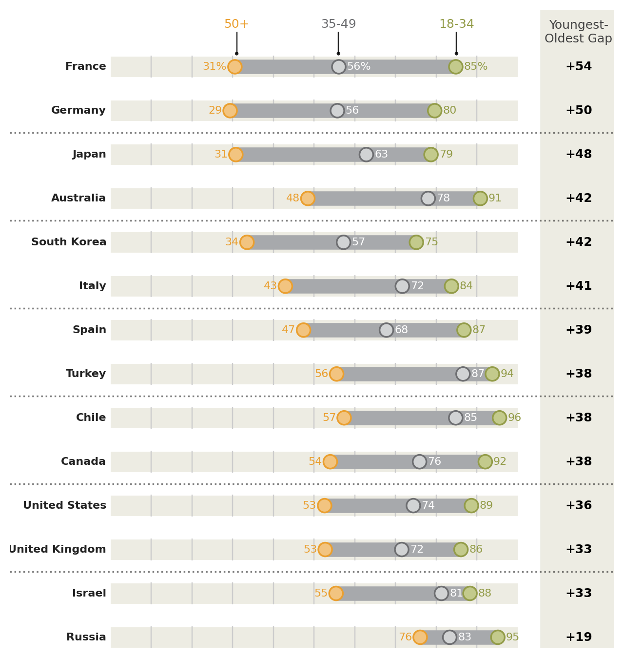
Instead of looking at this plot as having a country variable on the y-axis and a percentage variable on the x-axis, we can view it as having vertically stacked up many indepedent variables, the values of which have a similar scale.
Protip: Save a pdf file.
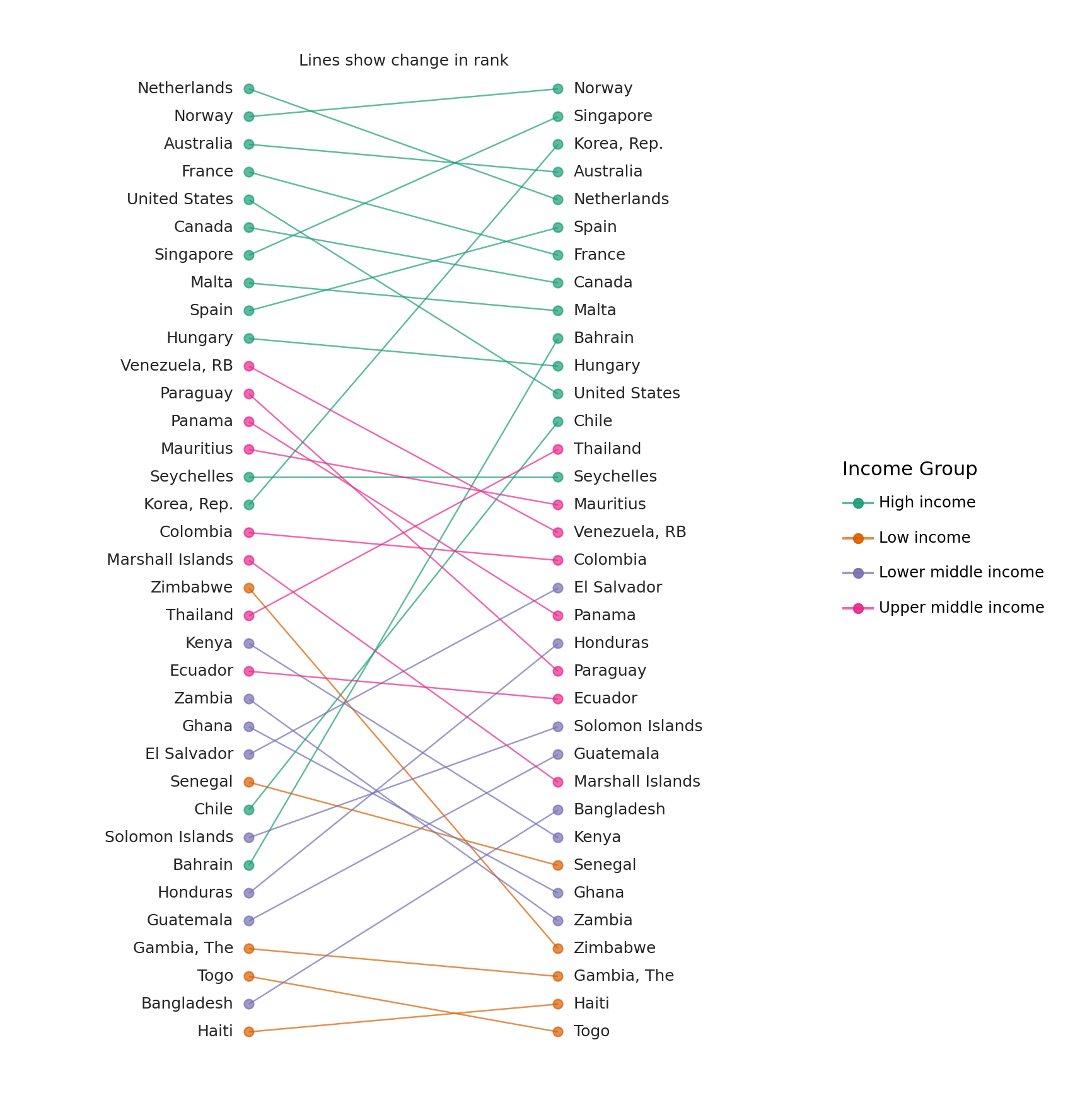
Change in Rank
Comparing a group of ranked items at two different times
Read the data.
Source: World Bank - Infanct Mortality Rate (per 1,000 live births)b
data = pl.read_csv(
    'data/API_SP.DYN.IMRT.IN_DS2_en_csv_v2/API_SP.DYN.IMRT.IN_DS2_en_csv_v2.csv',
    skip_rows=4,
    null_values="",
)

# Columns as valid python variables
year_columns = {c: f'y{c}' for c in data.columns if c[:2] in {'19', '20'}}
data = data.rename({
    'Country Name': 'country',
    'Country Code': 'code',
    **year_columns
}).drop(['Indicator Name', 'Indicator Code'])
data.head()
shape: (5, 59)
| country | code | y1960 | y1961 | y1962 | y1963 | y1964 | y1965 | y1966 | y1967 | y1968 | y1969 | y1970 | y1971 | y1972 | y1973 | y1974 | y1975 | y1976 | y1977 | y1978 | y1979 | y1980 | y1981 | y1982 | y1983 | y1984 | y1985 | y1986 | y1987 | y1988 | y1989 | y1990 | y1991 | y1992 | y1993 | y1994 | y1995 | y1996 | y1997 | y1998 | y1999 | y2000 | y2001 | y2002 | y2003 | y2004 | y2005 | y2006 | y2007 | y2008 | y2009 | y2010 | y2011 | y2012 | y2013 | y2014 | y2015 | y2016 |
|---|---|---|---|---|---|---|---|---|---|---|---|---|---|---|---|---|---|---|---|---|---|---|---|---|---|---|---|---|---|---|---|---|---|---|---|---|---|---|---|---|---|---|---|---|---|---|---|---|---|---|---|---|---|---|---|---|---|---|
| str | str | f64 | f64 | f64 | f64 | f64 | f64 | f64 | f64 | f64 | f64 | f64 | f64 | f64 | f64 | f64 | f64 | f64 | f64 | f64 | f64 | f64 | f64 | f64 | f64 | f64 | f64 | f64 | f64 | f64 | f64 | f64 | f64 | f64 | f64 | f64 | f64 | f64 | f64 | f64 | f64 | f64 | f64 | f64 | f64 | f64 | f64 | f64 | f64 | f64 | f64 | f64 | f64 | f64 | f64 | f64 | f64 | str |
| "Aruba" | "ABW" | null | null | null | null | null | null | null | null | null | null | null | null | null | null | null | null | null | null | null | null | null | null | null | null | null | null | null | null | null | null | null | null | null | null | null | null | null | null | null | null | null | null | null | null | null | null | null | null | null | null | null | null | null | null | null | null | null |
| "Afghanistan" | "AFG" | null | 240.5 | 236.3 | 232.3 | 228.5 | 224.6 | 220.7 | 217.0 | 213.3 | 209.8 | 206.1 | 202.2 | 198.2 | 194.3 | 190.3 | 186.6 | 182.6 | 178.7 | 174.5 | 170.4 | 166.1 | 161.8 | 157.5 | 153.2 | 148.7 | 144.5 | 140.2 | 135.7 | 131.3 | 126.8 | 122.5 | 118.3 | 114.4 | 110.9 | 107.7 | 105.0 | 102.7 | 100.7 | 98.9 | 97.2 | 95.4 | 93.4 | 91.2 | 89.0 | 86.7 | 84.4 | 82.3 | 80.4 | 78.6 | 76.8 | 75.1 | 73.4 | 71.7 | 69.9 | 68.1 | 66.3 | null |
| "Angola" | "AGO" | null | null | null | null | null | null | null | null | null | null | null | null | null | null | null | null | null | null | null | null | 138.3 | 137.5 | 136.8 | 136.0 | 135.3 | 134.9 | 134.4 | 134.1 | 133.8 | 133.6 | 133.5 | 133.5 | 133.5 | 133.4 | 133.2 | 132.8 | 132.3 | 131.5 | 130.6 | 129.5 | 128.3 | 126.9 | 125.5 | 124.1 | 122.8 | 121.2 | 119.4 | 117.1 | 114.7 | 112.2 | 109.6 | 106.8 | 104.1 | 101.4 | 98.8 | 96.0 | null |
| "Albania" | "ALB" | null | null | null | null | null | null | null | null | null | null | null | null | null | null | null | null | null | null | 73.0 | 68.4 | 64.0 | 59.9 | 56.1 | 52.4 | 49.1 | 45.9 | 43.2 | 40.8 | 38.6 | 36.7 | 35.1 | 33.7 | 32.5 | 31.4 | 30.3 | 29.1 | 27.9 | 26.8 | 25.5 | 24.4 | 23.2 | 22.1 | 21.0 | 20.0 | 19.1 | 18.3 | 17.4 | 16.7 | 16.0 | 15.4 | 14.8 | 14.3 | 13.8 | 13.3 | 12.9 | 12.5 | null |
| "Andorra" | "AND" | null | null | null | null | null | null | null | null | null | null | null | null | null | null | null | null | null | null | null | null | null | null | null | null | null | null | null | null | null | null | 7.5 | 7.0 | 6.5 | 6.1 | 5.6 | 5.2 | 5.0 | 4.6 | 4.3 | 4.1 | 3.9 | 3.7 | 3.5 | 3.3 | 3.2 | 3.1 | 2.9 | 2.8 | 2.7 | 2.6 | 2.5 | 2.4 | 2.3 | 2.2 | 2.1 | 2.1 | null |
The data includes regional aggregates. To tell apart the regional aggregates we need the metadata. Every row in the data table has a corresponding row in the metadata table. Where the row has regional aggregate data, the Region column in the metadata table is NaN.
def ordered_categorical(s, categories=None):
    """
    Create a categorical ordered according to the categories
    """
    name = getattr(s, 'name', '')
    if categories is None:
        return pl.Series(name, s).cast(pl.Categorical)

    with pl.StringCache():
        pl.Series(categories).cast(pl.Categorical)
        return pl.Series(name, s).cast(pl.Categorical)

columns = {
    'Country Code': 'code',
    'Region': 'region',
    'IncomeGroup': 'income_group'
}

metadata = pl.scan_csv(
    'data/API_SP.DYN.IMRT.IN_DS2_en_csv_v2/Metadata_Country_API_SP.DYN.IMRT.IN_DS2_en_csv_v2.csv'
).rename(
    columns
).select(
    list(columns.values())
).filter(
    # Drop the regional aggregate information
    (col('region') != '') & (col('income_group') != '')
).collect()

cat_order = ['High income', 'Upper middle income', 'Lower middle income', 'Low income']
metadata = metadata.with_columns([
    ordered_categorical(metadata['income_group'], cat_order)
])

metadata.head(10)
shape: (10, 3)
| code | region | income_group |
|---|---|---|
| str | str | cat |
| "ABW" | "Latin America ... | "High income" |
| "AFG" | "South Asia" | "Low income" |
| "AGO" | "Sub-Saharan Af... | "Lower middle i... |
| "ALB" | "Europe & Centr... | "Upper middle i... |
| "AND" | "Europe & Centr... | "High income" |
| "ARE" | "Middle East & ... | "High income" |
| "ARG" | "Latin America ... | "Upper middle i... |
| "ARM" | "Europe & Centr... | "Lower middle i... |
| "ASM" | "East Asia & Pa... | "Upper middle i... |
| "ATG" | "Latin America ... | "High income" |
Remove the regional aggregates, to create a table with only country data
country_data = data.join(metadata, on='code')
country_data.head()
shape: (5, 61)
| country | code | y1960 | y1961 | y1962 | y1963 | y1964 | y1965 | y1966 | y1967 | y1968 | y1969 | y1970 | y1971 | y1972 | y1973 | y1974 | y1975 | y1976 | y1977 | y1978 | y1979 | y1980 | y1981 | y1982 | y1983 | y1984 | y1985 | y1986 | y1987 | y1988 | y1989 | y1990 | y1991 | y1992 | y1993 | y1994 | y1995 | y1996 | y1997 | y1998 | y1999 | y2000 | y2001 | y2002 | y2003 | y2004 | y2005 | y2006 | y2007 | y2008 | y2009 | y2010 | y2011 | y2012 | y2013 | y2014 | y2015 | y2016 | region | income_group |
|---|---|---|---|---|---|---|---|---|---|---|---|---|---|---|---|---|---|---|---|---|---|---|---|---|---|---|---|---|---|---|---|---|---|---|---|---|---|---|---|---|---|---|---|---|---|---|---|---|---|---|---|---|---|---|---|---|---|---|---|---|
| str | str | f64 | f64 | f64 | f64 | f64 | f64 | f64 | f64 | f64 | f64 | f64 | f64 | f64 | f64 | f64 | f64 | f64 | f64 | f64 | f64 | f64 | f64 | f64 | f64 | f64 | f64 | f64 | f64 | f64 | f64 | f64 | f64 | f64 | f64 | f64 | f64 | f64 | f64 | f64 | f64 | f64 | f64 | f64 | f64 | f64 | f64 | f64 | f64 | f64 | f64 | f64 | f64 | f64 | f64 | f64 | f64 | str | str | cat |
| "Aruba" | "ABW" | null | null | null | null | null | null | null | null | null | null | null | null | null | null | null | null | null | null | null | null | null | null | null | null | null | null | null | null | null | null | null | null | null | null | null | null | null | null | null | null | null | null | null | null | null | null | null | null | null | null | null | null | null | null | null | null | null | "Latin America ... | "High income" |
| "Afghanistan" | "AFG" | null | 240.5 | 236.3 | 232.3 | 228.5 | 224.6 | 220.7 | 217.0 | 213.3 | 209.8 | 206.1 | 202.2 | 198.2 | 194.3 | 190.3 | 186.6 | 182.6 | 178.7 | 174.5 | 170.4 | 166.1 | 161.8 | 157.5 | 153.2 | 148.7 | 144.5 | 140.2 | 135.7 | 131.3 | 126.8 | 122.5 | 118.3 | 114.4 | 110.9 | 107.7 | 105.0 | 102.7 | 100.7 | 98.9 | 97.2 | 95.4 | 93.4 | 91.2 | 89.0 | 86.7 | 84.4 | 82.3 | 80.4 | 78.6 | 76.8 | 75.1 | 73.4 | 71.7 | 69.9 | 68.1 | 66.3 | null | "South Asia" | "Low income" |
| "Angola" | "AGO" | null | null | null | null | null | null | null | null | null | null | null | null | null | null | null | null | null | null | null | null | 138.3 | 137.5 | 136.8 | 136.0 | 135.3 | 134.9 | 134.4 | 134.1 | 133.8 | 133.6 | 133.5 | 133.5 | 133.5 | 133.4 | 133.2 | 132.8 | 132.3 | 131.5 | 130.6 | 129.5 | 128.3 | 126.9 | 125.5 | 124.1 | 122.8 | 121.2 | 119.4 | 117.1 | 114.7 | 112.2 | 109.6 | 106.8 | 104.1 | 101.4 | 98.8 | 96.0 | null | "Sub-Saharan Af... | "Lower middle i... |
| "Albania" | "ALB" | null | null | null | null | null | null | null | null | null | null | null | null | null | null | null | null | null | null | 73.0 | 68.4 | 64.0 | 59.9 | 56.1 | 52.4 | 49.1 | 45.9 | 43.2 | 40.8 | 38.6 | 36.7 | 35.1 | 33.7 | 32.5 | 31.4 | 30.3 | 29.1 | 27.9 | 26.8 | 25.5 | 24.4 | 23.2 | 22.1 | 21.0 | 20.0 | 19.1 | 18.3 | 17.4 | 16.7 | 16.0 | 15.4 | 14.8 | 14.3 | 13.8 | 13.3 | 12.9 | 12.5 | null | "Europe & Centr... | "Upper middle i... |
| "Andorra" | "AND" | null | null | null | null | null | null | null | null | null | null | null | null | null | null | null | null | null | null | null | null | null | null | null | null | null | null | null | null | null | null | 7.5 | 7.0 | 6.5 | 6.1 | 5.6 | 5.2 | 5.0 | 4.6 | 4.3 | 4.1 | 3.9 | 3.7 | 3.5 | 3.3 | 3.2 | 3.1 | 2.9 | 2.8 | 2.7 | 2.6 | 2.5 | 2.4 | 2.3 | 2.2 | 2.1 | 2.1 | null | "Europe & Centr... | "High income" |
We are interested in the changes in rank between 1960 and 2015. To plot a reasonable sized graph, we randomly sample 35 countries.
sampled_data = country_data.drop_nulls(
    subset=['y1960', 'y2015']
).sample(
    n=35,
    seed=123
).with_columns([
    col('y1960').rank(method='ordinal').cast(pl.Int64).suffix('_rank'),
    col('y2015').rank(method='ordinal').cast(pl.Int64).suffix('_rank')
]).sort('y2015_rank', reverse=True)

sampled_data.head()
shape: (5, 63)
| country | code | y1960 | y1961 | y1962 | y1963 | y1964 | y1965 | y1966 | y1967 | y1968 | y1969 | y1970 | y1971 | y1972 | y1973 | y1974 | y1975 | y1976 | y1977 | y1978 | y1979 | y1980 | y1981 | y1982 | y1983 | y1984 | y1985 | y1986 | y1987 | y1988 | y1989 | y1990 | y1991 | y1992 | y1993 | y1994 | y1995 | y1996 | y1997 | y1998 | y1999 | y2000 | y2001 | y2002 | y2003 | y2004 | y2005 | y2006 | y2007 | y2008 | y2009 | y2010 | y2011 | y2012 | y2013 | y2014 | y2015 | y2016 | region | income_group | y1960_rank | y2015_rank |
|---|---|---|---|---|---|---|---|---|---|---|---|---|---|---|---|---|---|---|---|---|---|---|---|---|---|---|---|---|---|---|---|---|---|---|---|---|---|---|---|---|---|---|---|---|---|---|---|---|---|---|---|---|---|---|---|---|---|---|---|---|---|---|
| str | str | f64 | f64 | f64 | f64 | f64 | f64 | f64 | f64 | f64 | f64 | f64 | f64 | f64 | f64 | f64 | f64 | f64 | f64 | f64 | f64 | f64 | f64 | f64 | f64 | f64 | f64 | f64 | f64 | f64 | f64 | f64 | f64 | f64 | f64 | f64 | f64 | f64 | f64 | f64 | f64 | f64 | f64 | f64 | f64 | f64 | f64 | f64 | f64 | f64 | f64 | f64 | f64 | f64 | f64 | f64 | f64 | str | str | cat | i64 | i64 |
| "Togo" | "TGO" | 162.4 | 159.4 | 156.4 | 153.5 | 150.5 | 147.7 | 144.7 | 141.8 | 138.8 | 135.8 | 132.8 | 130.0 | 127.2 | 124.4 | 121.8 | 119.2 | 116.6 | 114.1 | 111.7 | 109.2 | 106.9 | 104.8 | 102.7 | 100.7 | 98.9 | 97.1 | 95.5 | 94.0 | 92.6 | 91.4 | 90.2 | 89.0 | 87.9 | 86.8 | 85.5 | 84.2 | 82.8 | 81.2 | 79.6 | 77.9 | 76.2 | 74.4 | 72.6 | 70.8 | 69.1 | 67.4 | 65.7 | 64.1 | 62.5 | 60.9 | 59.3 | 57.9 | 56.5 | 55.0 | 53.6 | 52.3 | null | "Sub-Saharan Af... | "Low income" | 33 | 35 |
| "Haiti" | "HTI" | 194.8 | 191.5 | 188.3 | 185.2 | 182.2 | 179.1 | 176.0 | 172.9 | 169.8 | 166.6 | 163.4 | 160.1 | 156.6 | 153.0 | 149.5 | 146.0 | 142.6 | 139.2 | 135.8 | 132.5 | 129.4 | 126.2 | 123.0 | 120.0 | 117.1 | 114.3 | 111.5 | 108.8 | 106.1 | 103.5 | 101.0 | 98.4 | 95.8 | 93.1 | 90.4 | 87.8 | 85.1 | 82.4 | 79.9 | 77.4 | 75.0 | 72.8 | 70.7 | 68.9 | 67.2 | 65.6 | 64.1 | 62.7 | 61.3 | 60.0 | 85.5 | 57.5 | 56.2 | 54.8 | 53.5 | 52.2 | null | "Latin America ... | "Low income" | 35 | 34 |
| "Gambia, The" | "GMB" | 148.4 | 146.1 | 143.8 | 141.5 | 139.3 | 137.1 | 134.9 | 132.6 | 130.5 | 128.3 | 126.0 | 123.8 | 121.5 | 119.1 | 116.7 | 114.4 | 112.1 | 109.8 | 107.6 | 105.4 | 103.2 | 100.9 | 98.6 | 96.2 | 93.7 | 91.3 | 88.9 | 86.5 | 84.3 | 82.1 | 80.0 | 78.0 | 76.1 | 74.3 | 72.6 | 70.9 | 69.3 | 67.7 | 66.2 | 64.8 | 63.3 | 62.0 | 60.6 | 59.3 | 58.0 | 56.8 | 55.6 | 54.5 | 53.6 | 52.6 | 51.7 | 50.9 | 50.1 | 49.4 | 48.6 | 47.9 | null | "Sub-Saharan Af... | "Low income" | 32 | 33 |
| "Zimbabwe" | "ZWE" | 92.6 | 90.1 | 87.6 | 85.3 | 82.8 | 80.5 | 78.3 | 76.3 | 74.7 | 73.4 | 72.4 | 71.6 | 71.1 | 70.7 | 70.5 | 70.3 | 70.1 | 69.8 | 69.2 | 68.1 | 66.4 | 64.2 | 61.6 | 58.8 | 56.0 | 53.6 | 51.7 | 50.4 | 49.8 | 50.2 | 51.2 | 52.6 | 54.5 | 56.4 | 58.1 | 60.1 | 61.6 | 62.7 | 63.3 | 63.5 | 63.5 | 63.2 | 62.7 | 61.9 | 61.5 | 61.0 | 60.3 | 59.9 | 58.9 | 57.7 | 55.8 | 54.0 | 49.4 | 48.8 | 47.6 | 46.6 | null | "Sub-Saharan Af... | "Low income" | 19 | 32 |
| "Zambia" | "ZMB" | 123.2 | 120.9 | 118.7 | 116.7 | 115.1 | 114.0 | 113.3 | 112.9 | 112.2 | 111.1 | 109.3 | 106.7 | 103.7 | 100.7 | 98.1 | 96.3 | 95.3 | 95.1 | 95.3 | 95.6 | 96.1 | 97.0 | 98.3 | 100.2 | 102.7 | 105.6 | 108.3 | 110.6 | 112.2 | 113.1 | 113.3 | 113.0 | 112.4 | 111.3 | 109.7 | 107.8 | 106.1 | 104.6 | 103.1 | 100.9 | 97.6 | 92.7 | 86.5 | 80.0 | 73.9 | 68.7 | 64.9 | 61.3 | 58.7 | 55.6 | 52.9 | 51.1 | 49.0 | 46.5 | 44.7 | 43.3 | null | "Sub-Saharan Af... | "Lower middle i... | 23 | 31 |
First graph
(ggplot(sampled_data)
 + geom_text(aes(1, 'y1960_rank', label='country'), ha='right', size=9)
 + geom_text(aes(2, 'y2015_rank', label='country'), ha='left', size=9)
 + geom_point(aes(1, 'y1960_rank', color='income_group'), size=2.5)
 + geom_point(aes(2, 'y2015_rank', color='income_group'), size=2.5)
 + geom_segment(aes(x=1, y='y1960_rank', xend=2, yend='y2015_rank', color='income_group'))
 + scale_y_reverse()
)![]()
It has the form we want, but we need to tweak it.
# Text colors
black1 = '#252525'
black2 = '#222222'

# Gallery Plot

(ggplot(sampled_data)
 # Slight modifications for the original lines,
 # 1. Nudge the text to either sides of the points
 # 2. Alter the color and alpha values
 + geom_text(aes(1, 'y1960_rank', label='country'), nudge_x=-0.05, ha='right', size=9, color=black1)
 + geom_text(aes(2, 'y2015_rank', label='country'), nudge_x=0.05, ha='left', size=9, color=black1)
 + geom_point(aes(1, 'y1960_rank', color='income_group'), size=2.5, alpha=.7)
 + geom_point(aes(2, 'y2015_rank', color='income_group'), size=2.5, alpha=.7)
 + geom_segment(aes(x=1, y='y1960_rank', xend=2, yend='y2015_rank', color='income_group'), alpha=.7)

 # Text Annotations
 #+ annotate('text', x=1, y=0, label='Rank in 1960', fontweight='bold', ha='right', size=10, color=black2)
 #+ annotate('text', x=2, y=0, label='Rank in 2015', fontweight='bold', ha='left', size=10, color=black2)
 + annotate('text', x=1.5, y=0, label='Lines show change in rank', size=9, color=black1)
 #+ annotate('label', x=1.5, y=3, label='Lower infant\ndeath rates', size=9, color=black1,
 #           label_size=0, fontstyle='italic')
 #+ annotate('label', x=1.5, y=33, label='Higher infant\ndeath rates', size=9, color=black1,
 #           label_size=0, fontstyle='italic')

 # Prevent country names from being chopped off
 + lims(x=(0.35, 2.65))
 + labs(color='Income Group')
 # Countries with lower rates on top
 + scale_y_reverse()
 # Change colors
 + scale_color_brewer(type='qual', palette=2)
 # Removes all decorations
 + theme_void()
 # Changing the figure size prevents the country names from squishing up
 + theme(figure_size=(8, 11))
)