import pandas as pd
import numpy as np

from plotnine import (
    ggplot,
    aes,
    after_stat,
    geom_density,
    geom_histogram,
    geom_vline,
    geom_rect,
    labs,
    annotate,
    theme_tufte
)
from plotnine.data import mpgDensity Plot
mpg.head()| manufacturer | model | displ | year | cyl | trans | drv | cty | hwy | fl | class | |
|---|---|---|---|---|---|---|---|---|---|---|---|
| 0 | audi | a4 | 1.8 | 1999 | 4 | auto(l5) | f | 18 | 29 | p | compact |
| 1 | audi | a4 | 1.8 | 1999 | 4 | manual(m5) | f | 21 | 29 | p | compact |
| 2 | audi | a4 | 2.0 | 2008 | 4 | manual(m6) | f | 20 | 31 | p | compact |
| 3 | audi | a4 | 2.0 | 2008 | 4 | auto(av) | f | 21 | 30 | p | compact |
| 4 | audi | a4 | 2.8 | 1999 | 6 | auto(l5) | f | 16 | 26 | p | compact |
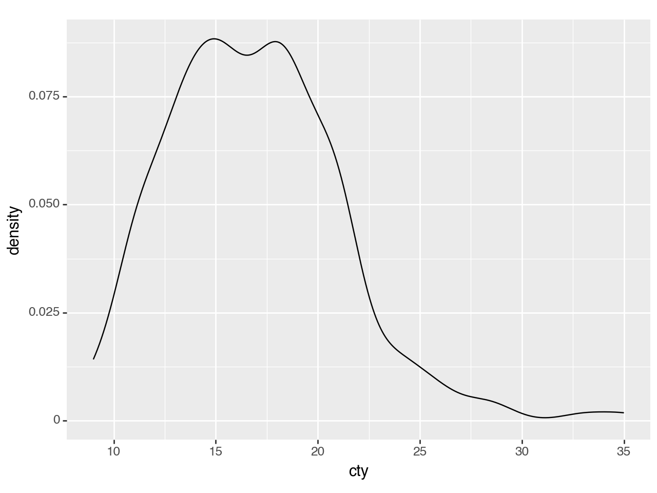
The defaults are not exactly beautiful, but still quite clear.
(ggplot(mpg, aes(x='cty'))
 + geom_density()
)
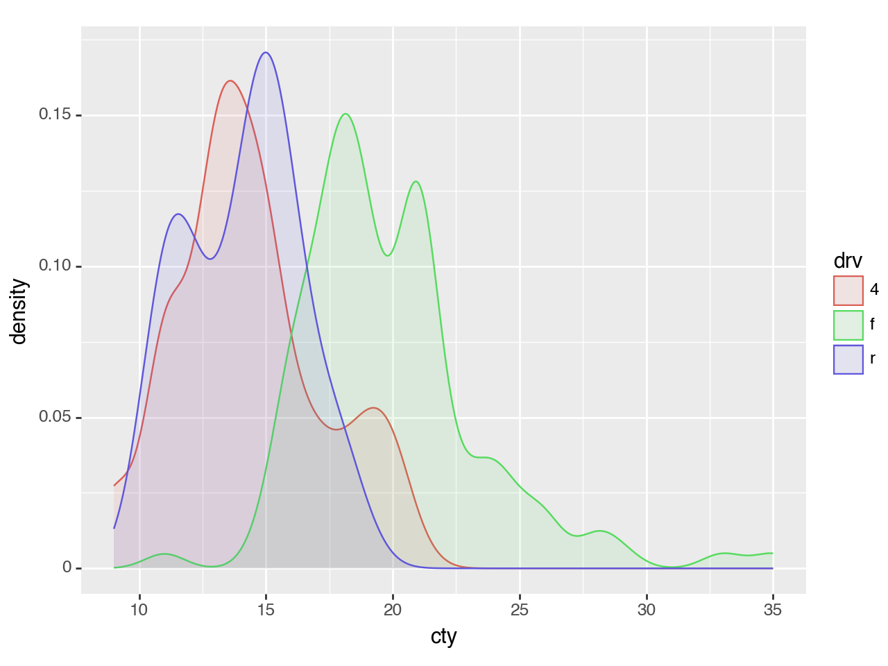
<Figure Size: (640 x 480)>Plotting multiple groups is straightforward, but as each group is plotted as an independent PDF summing to 1, the relative size of each group will be normalized.
(ggplot(mpg, aes(x='cty', color='drv', fill='drv'))
 + geom_density(alpha=0.1)
)
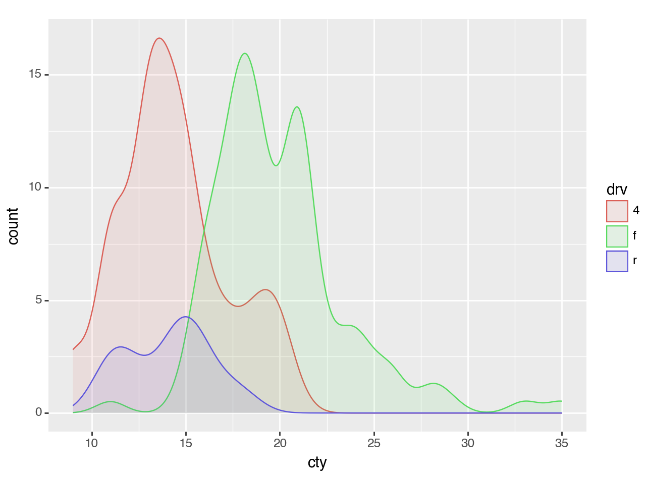
<Figure Size: (640 x 480)>To plot multiple groups and scale them by their relative size, you can map the y aesthetic to 'count' (calculated by stat_density).
(ggplot(mpg, aes(x='cty', color='drv', fill='drv'))
 + geom_density(aes(y=after_stat('count')), alpha=0.1)
)
<Figure Size: (640 x 480)>Density Plot + Histogram
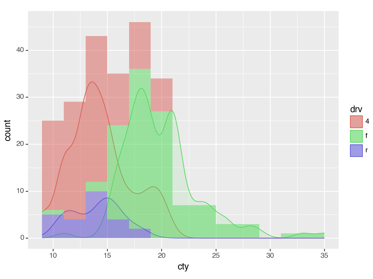
To overlay a histogram onto the density, the y aesthetic of the density should be mapped to the 'count' scaled by the binwidth of the histograms.
Why?
The count calculated by stat_density is \(count = density * n\) where n is the number of points . The density curves have an area of 1 and have no information about the absolute frequency of the values along curve; only the relative frequencies. The count curve reveals the absolute frequencies. The scale of this count corresponds to the count calculated by the stat_bin for the histogram when the bins are 1 unit wide i.e. binwidth=1. The count * binwidth curve matches the scale of counts for the histogram for a give binwidth.
binwidth = 2  # The same for geom_density and geom_histogram

(ggplot(mpg, aes(x='cty', color='drv', fill='drv'))
 + geom_density(aes(y=after_stat('count*binwidth')), alpha=0.1)
 + geom_histogram(aes(fill='drv', y=after_stat('count')), binwidth=binwidth, color='none', alpha=0.5)

 # It is the histogram that gives us the meaningful y axis label
 # i.e. 'count' and not 'count*2'
 + labs(y='count')
)
<Figure Size: (640 x 480)>Shading a Region under a Density Curve
Extending geom_density to create an effect of a shaded region
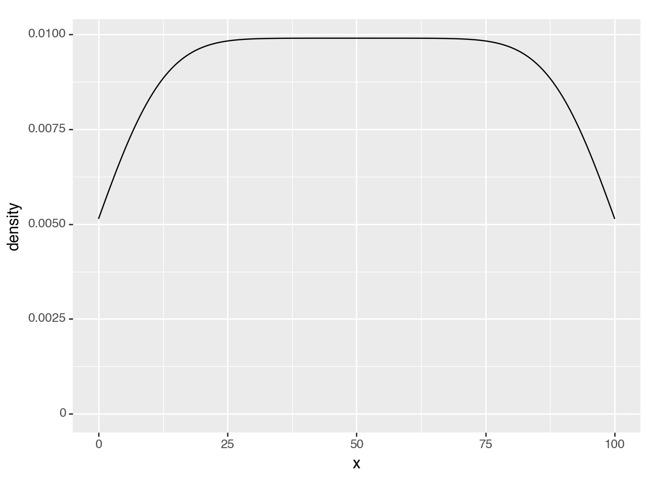
Create some data and plot the density
n = 101
df = pd.DataFrame({'x': np.arange(n)})

(ggplot(df, aes('x'))
 + geom_density()
)
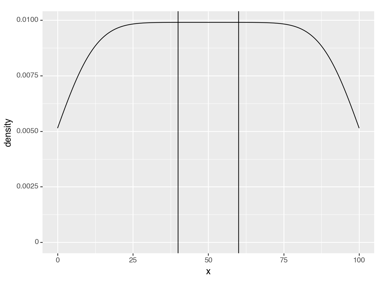
<Figure Size: (640 x 480)>Suppose we want to mark a region as special e.g. (40, 60), we can use vertical lines to annotate it.
region = (40, 60)

(ggplot(df, aes('x'))
 + geom_density()
 + annotate(geom_vline, xintercept=region)  #new line
)
<Figure Size: (640 x 480)>To make it standout more we can highlight. To do that, the first thought is to use a rectangle.
region = (40, 60)

(ggplot(df, aes('x'))
 + geom_density()
 + annotate(geom_rect, xmin=region[0], xmax=region[1], ymin=0, ymax=float('inf'), alpha=0.5) # new line
 + annotate(geom_vline, xintercept=region)
)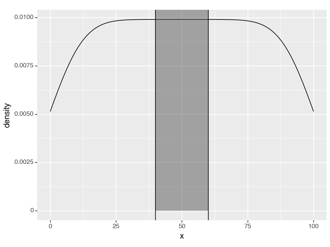
<Figure Size: (640 x 480)>Since y upper-bound varies along the curve, a rectangular highlight has to stretch up to the top of the panel.
To hightlight only within the density curve, we have to use a second density curve. We need to calculate the density as normal, but just before the curve & region are plotted, we should keep only the region we want.
We create our own geom_density_highlight and override the setup_data method. First, we override but do nothing, we only inspect the data to see what we have to work with.
# new class
class geom_density_highlight(geom_density):

    def setup_data(self, data):
        data = super().setup_data(data)
        print(data)
        return data


region = (40, 60)

(ggplot(df, aes('x'))
 + geom_density()
 + geom_density_highlight(fill='black', alpha=0.5)  # new line
 + annotate(geom_vline, xintercept=region)
)
PANEL count density group n scaled x y
0 1 0.519038 0.005139 -1 101 0.519039 0.000000 0.005139 \
1 1 0.522757 0.005176 -1 101 0.522758 0.097752 0.005176
2 1 0.526473 0.005213 -1 101 0.526474 0.195503 0.005213
3 1 0.530187 0.005249 -1 101 0.530188 0.293255 0.005249
4 1 0.533899 0.005286 -1 101 0.533900 0.391007 0.005286
... ... ... ... ... ... ... ... ...
1019 1 0.533899 0.005286 -1 101 0.533900 99.608993 0.005286
1020 1 0.530187 0.005249 -1 101 0.530188 99.706745 0.005249
1021 1 0.526473 0.005213 -1 101 0.526474 99.804497 0.005213
1022 1 0.522757 0.005176 -1 101 0.522758 99.902248 0.005176
1023 1 0.519038 0.005139 -1 101 0.519039 100.000000 0.005139
ymin ymax
0 0 0.005139
1 0 0.005176
2 0 0.005213
3 0 0.005249
4 0 0.005286
... ... ...
1019 0 0.005286
1020 0 0.005249
1021 0 0.005213
1022 0 0.005176
1023 0 0.005139
[1024 rows x 10 columns]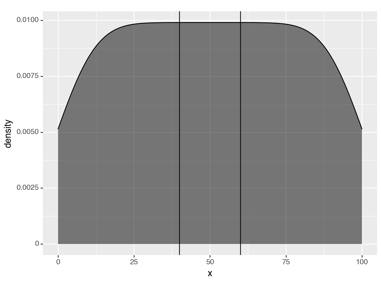
<Figure Size: (640 x 480)>The highlight has filled the whole region, but the printed data suggests that we can limit the rows to those where x column is within our region.
class geom_density_highlight(geom_density):

    # new method
    def __init__(self, *args, region=(-np.inf, np.inf), **kwargs):
        super().__init__(*args, **kwargs)
        self.region = region

    def setup_data(self, data):
        data = super().setup_data(data)
        s = f'{self.region[0]} <= x <= {self.region[1]}'  # new line
        data = data.query(s).reset_index(drop=True)       # new line
        return data


region = (40, 60)

(ggplot(df, aes('x'))
 + geom_density()
 + geom_density_highlight(region=region, fill='black', alpha=0.5) # modified line
 + annotate(geom_vline, xintercept=region)
)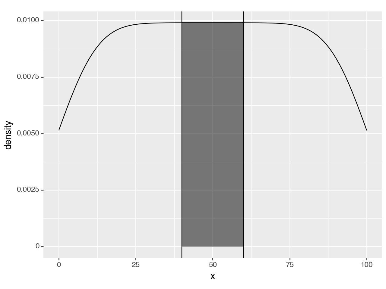
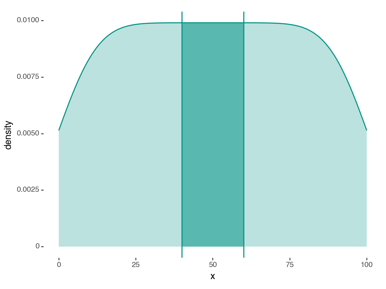
<Figure Size: (640 x 480)>That is it, but we can make it look better.
class geom_density_highlight(geom_density):

    def __init__(self, *args, region=(-np.inf, np.inf), **kwargs):
        super().__init__(*args, **kwargs)
        self.region = region

    def setup_data(self, data):
        data = super().setup_data(data)
        s = f'{self.region[0]} <= x <= {self.region[1]}'
        data = data.query(s).reset_index(drop=True)
        return data


region = (40, 60)
teal = '#029386'

# Gallery Plot

(ggplot(df, aes('x'))
 + geom_density_highlight(region=region, fill=teal+'88', color='none')
 + geom_density(fill=teal+'44', color=teal, size=.7)
 + annotate(geom_vline, xintercept=region, color=teal, size=.7)
 + theme_tufte()
)
<Figure Size: (640 x 480)>This example was motivated by a question from github user Rishika-Ravindran.